Designing the creator engine behind Jigri's path to ₹11.5M/month
Client:
Jigri
Role:
Founding Product Designer
Year:
2025-26

01 — Context
What is Jigri, and why do creators matter?

user recharges → calls creator → creator earns
My role & team

Founding Product Designer leading research, UX, and product strategy across monetization and creator systems while collaborating with engineering and ops to ship features that improved retention and revenue.
02 — Starting Point
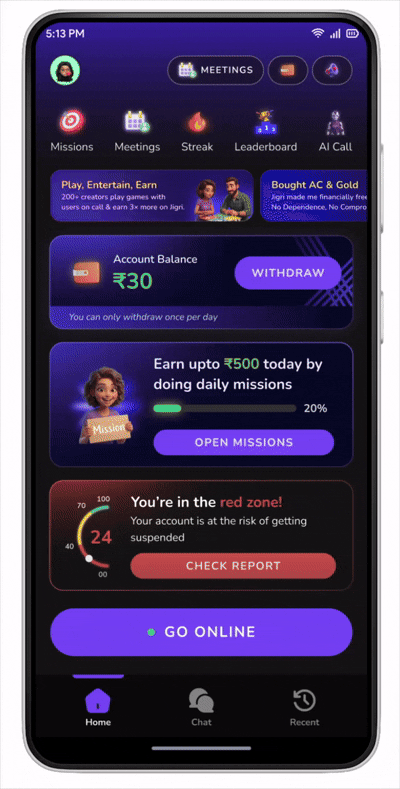
The MVP was barely functional
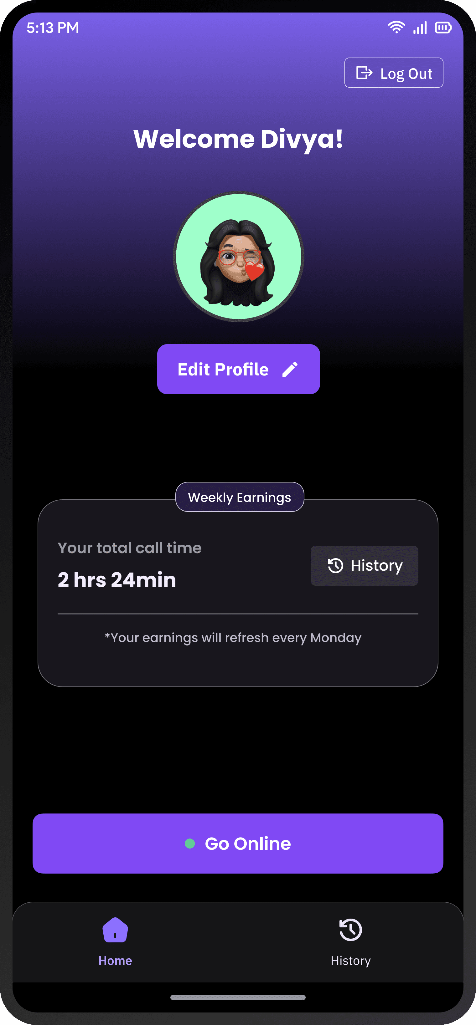
MVP Creator Home Screen
What We Learned
From data + user interviews, we found clear patterns:
Creators had no mental model for how the platform worked
No motivation system beyond vague promises of earnings
No feedback loop to help them improve


03 — Phase 1: Building the Incentive Engine
How do you make creators want to stay?
1. In-Call Earning Tiers
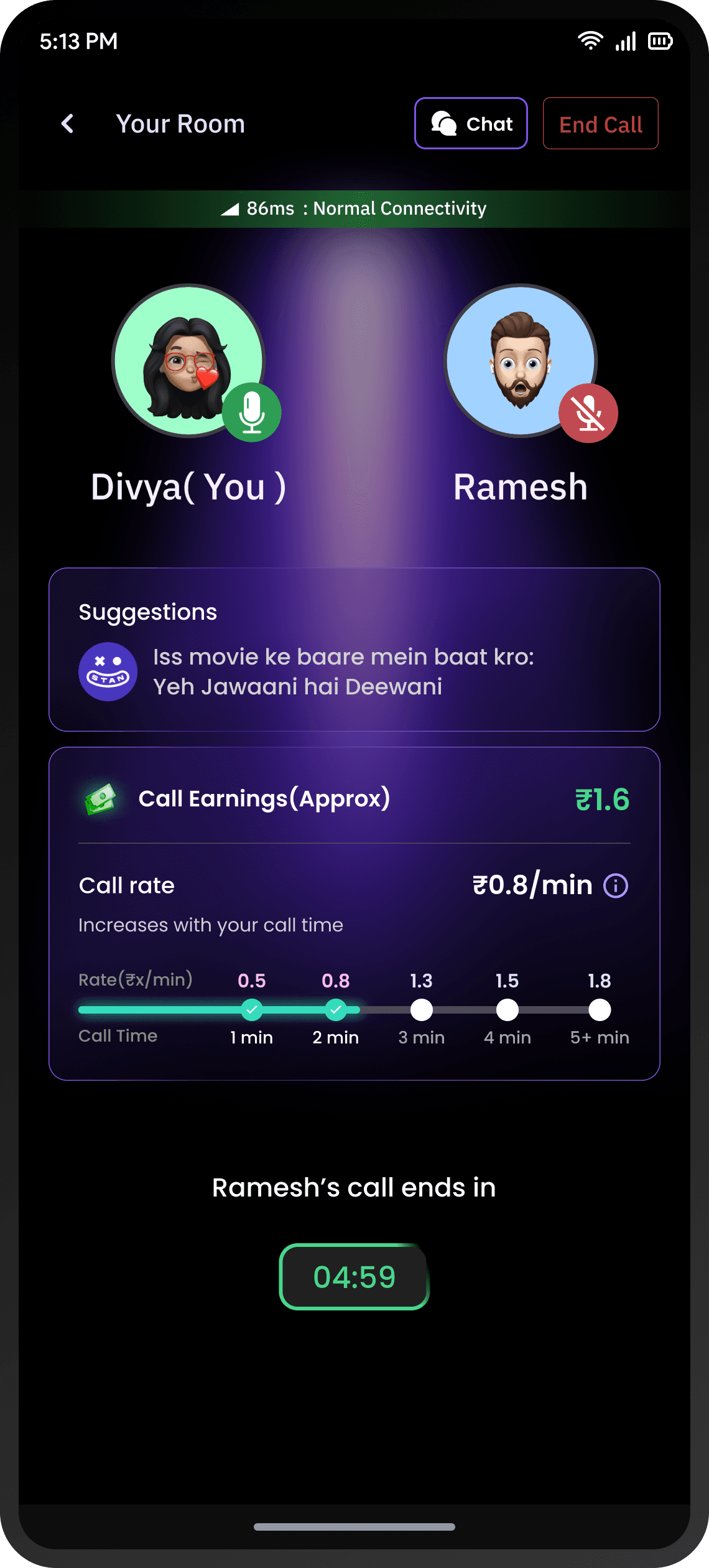
In-Call Earnings UI
Showing current earnings, tier checkpoints, and potential at next threshold
2. AI-Powered Call Feedback
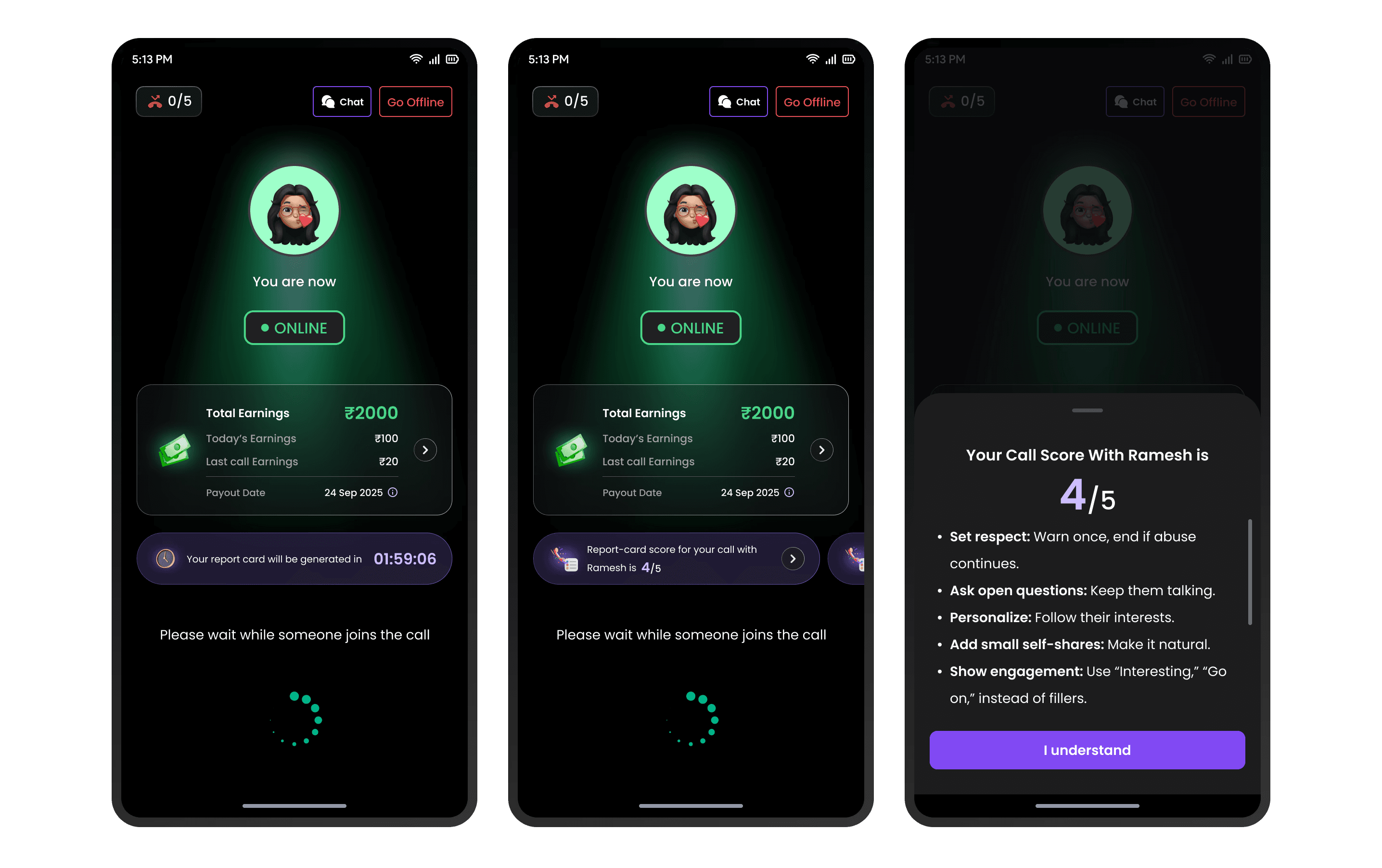
AI Call Feedback generation UI
3. Performance Bucketing (The Stick)
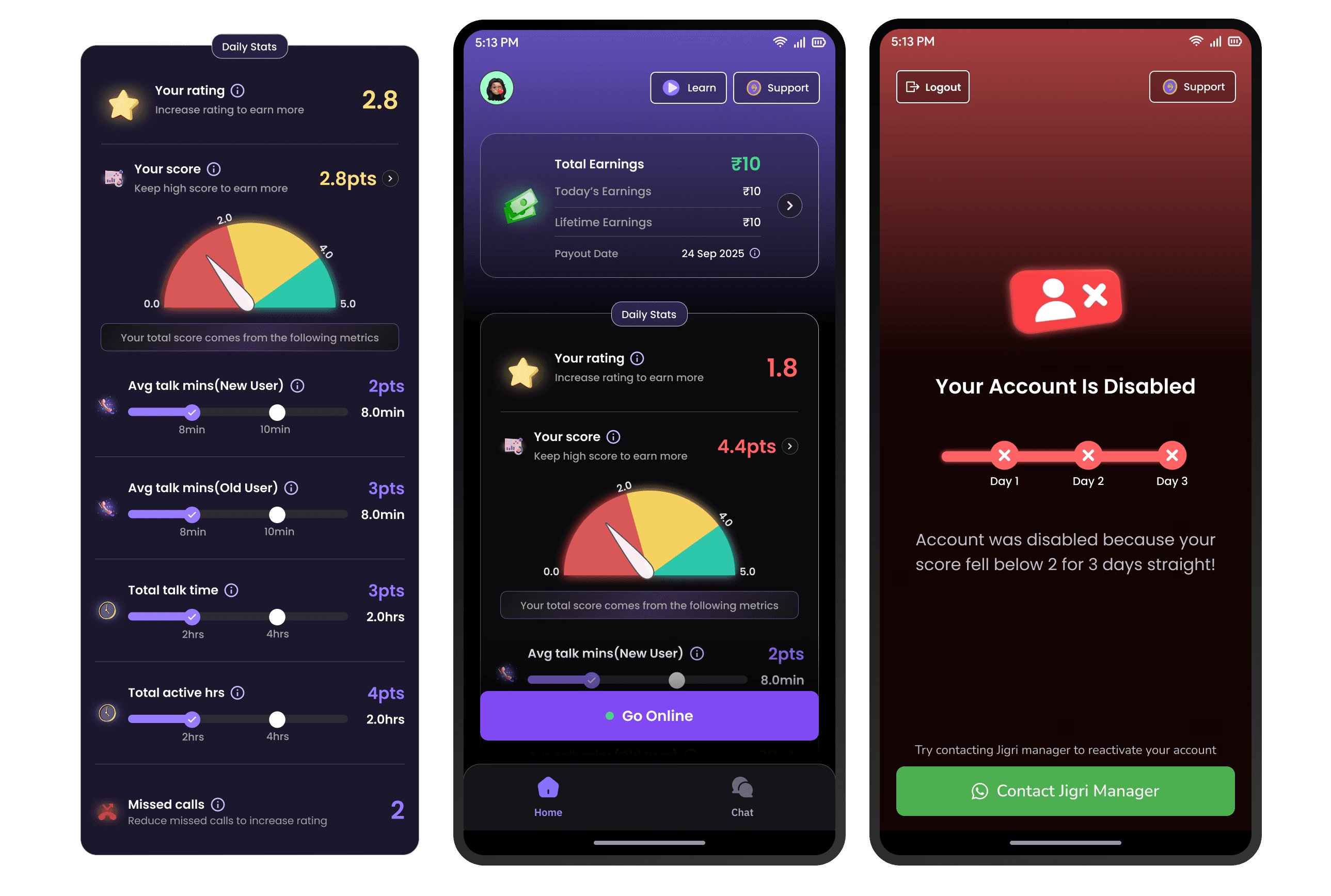
Performance score, zone status, and risk indicators
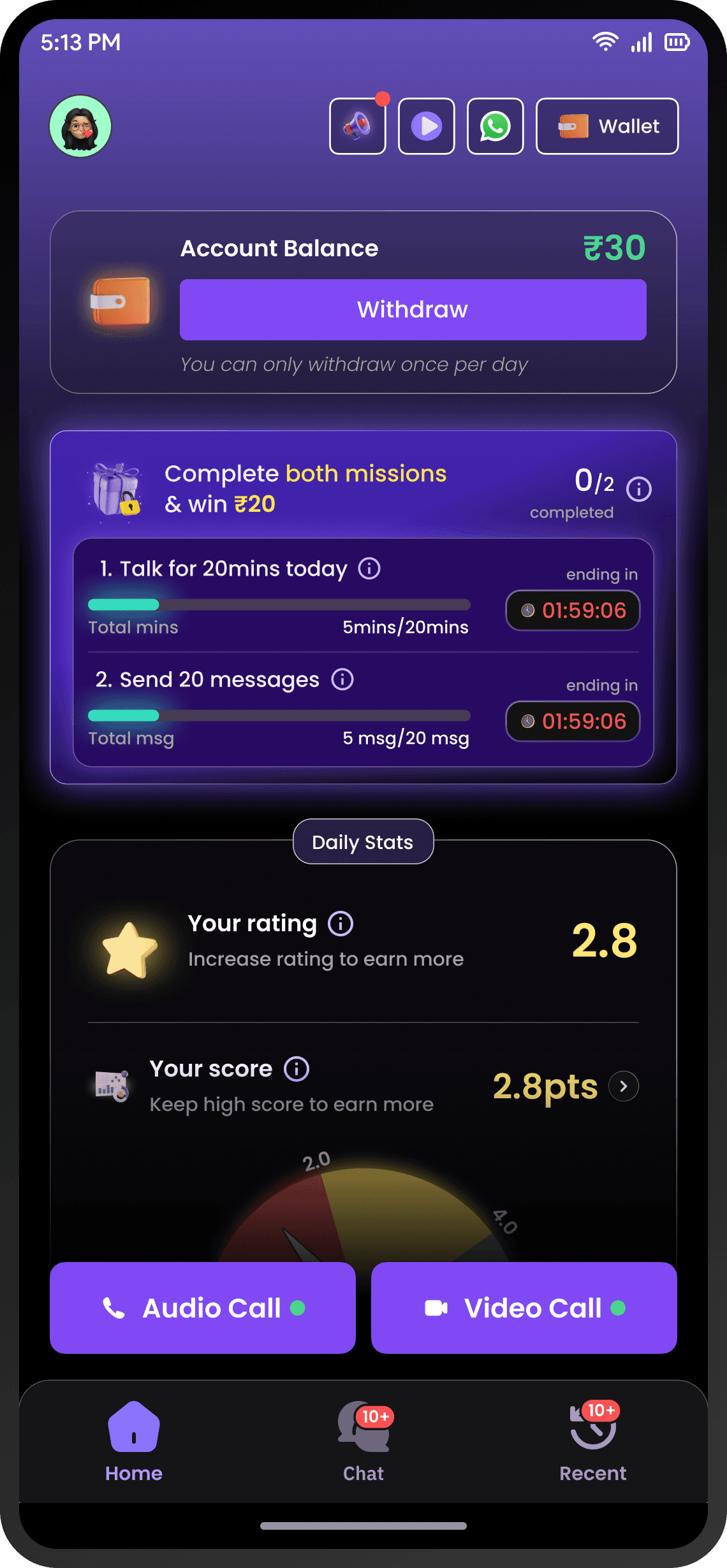
4. Wallets & Daily Missions
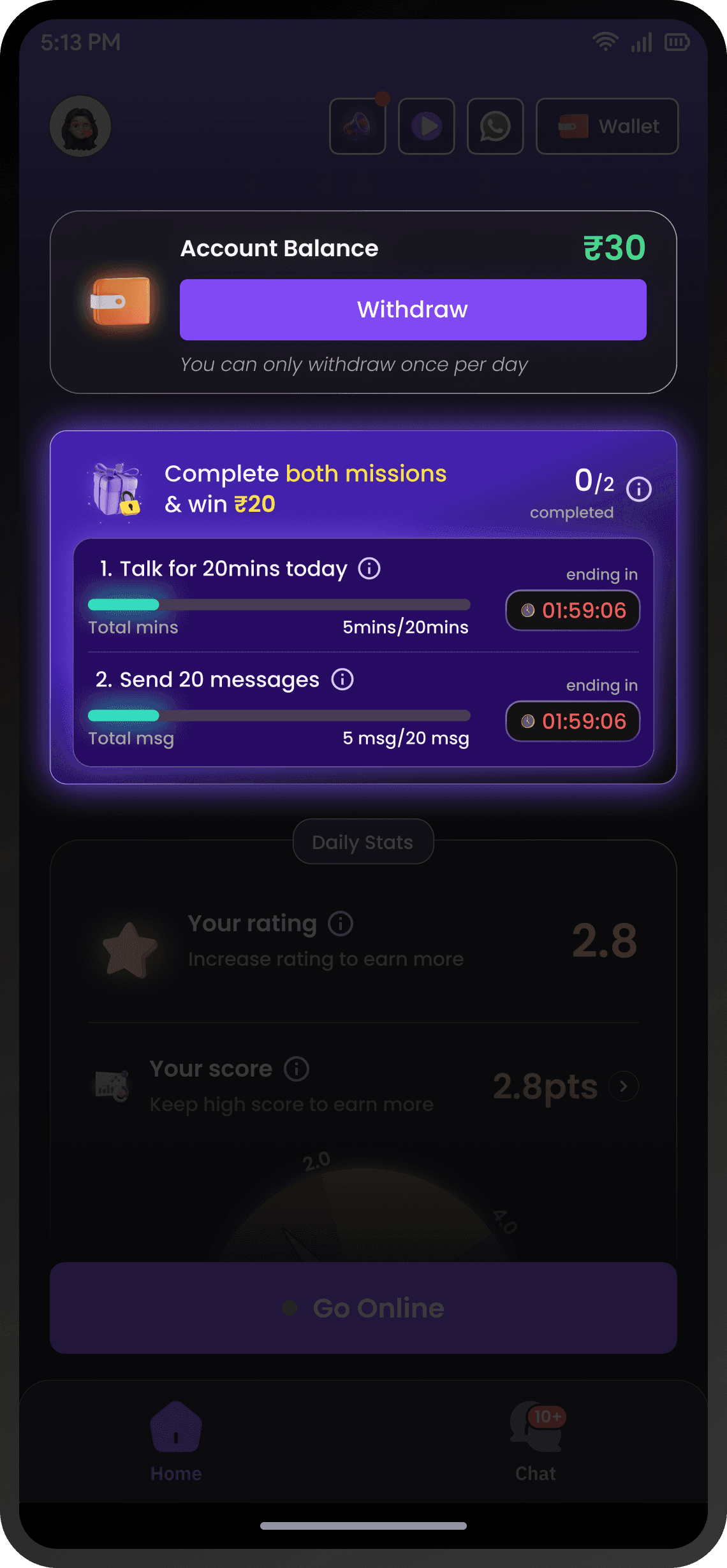
Wallet and Daily Missions UI
Design Insight
The missions system was designed so that the platform wins regardless of individual completion rates. Even failed attempts drive call volume and quality upward. The reward budget was optimized against collective metric lift, not individual payouts.
57%
Increase in creator
retention
2.3x
Increase in average
call duration
+30%
Indirect increase in
ARPPU
04 — Scaling Supply: Onboarding Redesign
From manual vetting to 4× onboarding efficiency
1
App walkthrough videos
New creators watch short platform explainer videos to build context before they even start.
2
AI voice screening
Creator records a voice sample for a given scenario. An AI model instantly scores quality and identifies gender — no human review needed.
3
Score-based rating assignment
The voice score determines the creator's initial rating, which affects their visibility to users.
4
Smart matching for first calls
New creators are only surfaced to P3+ users (3+ purchases) — users with strong calling intent. This ensures new creators get calls quickly while protecting new user first-call experience
4x
50%
05 — Phase 2: The Full Redesign
The features worked, but the experience was broken
Cluttered Home UI
The Phase 1 homepage with all metrics, missions, wallet, and performance visible simultaneously
The New Creator Journey Framework
1
Stage 1 — "I can earn money here"
Immediately after voice verification, the creator takes an AI-simulated call. This gives them a feel for the call experience while the AI collects persona data for future matching. On completing the AI call, the creator receives ₹10 — but the wallet is locked. The seed is planted: this app pays you.

Onboarding and Creator activation journey
Creator submitting her voice, going through verification, getting on an ai call and earning ₹10 as reward
2
Stage 2 — "I know how to earn money here"
To unlock the wallet, creators must earn ₹20 from real calls. The home page at this stage shows only the wallet and this single mission — nothing else. Progressive disclosure ensures no cognitive overload. Coachmarks guide the creator through going live and taking calls.

finishing first mission ( EARN ₹20 ) To unlock the wallet flow
Creator has to earn ₹20 through calls and then unlock wallet to withdraw the moeny earned. This will establish the trust for the app
3
Stage 3 — "I can earn even more"
Once the wallet is unlocked and the creator has withdrawn real money, the full home unlocks: missions with daily earning targets, performance analytics, AI call summaries, and in-call games. Creators are nudged to attend an ops intro call, and only after that does the complete experience open up.

New meeting alert flow

ANaLytics PAge Flow

Creator mission flow
Strategic Principle
UI Overhaul
2.5×
06 — Reflection
What I learned building a creator economy from zero
Incentive design is product design
The most impactful work I did wasn't screens — it was designing the incentive architecture. How earning tiers, missions, wallet locks, and performance zones all interlocked to create a system where individual self-interest drove collective platform health.
Progressive disclosure as a retention strategy
The Phase 2 redesign taught me that reducing features can increase engagement. The gated journey wasn't about hiding complexity — it was about earning the right to show it. Creators who unlocked each stage were far more invested because each step had required action and delivered on a promise.
AI as an ops multiplier
From voice screening to call feedback to persona matching, every AI integration was designed to replace a manual process. This wasn't AI for the sake of it — it was the only way to scale a two-person product team's ambitions without a 20-person ops team.