Dailyhunt

Redesigned Jigri’s monetization system from free calls to a segmented, behavioral model — doubling ARPPU (₹44 → ₹92) and driving 31% revenue growth, scaling the product to ₹35L+/month.

Redesigned Jigri’s monetization system from free calls to a segmented, behavioral model — doubling ARPPU (₹44 → ₹92) and driving 31% revenue growth, scaling the product to ₹40L+/month.

Redesigned Jigri’s monetization system from free calls to a segmented, behavioral model — doubling ARPPU (₹44 → ₹92) and driving 31% revenue growth, scaling the product to ₹35L+/month.

Product:

Spotify

Role:

Principle Designer

Year:

2021

3 screens from Dailyhunt app

Context

he challenge of the task is to create a landing page for a SaaS (Software as a Service) product that effectively communicates the value proposition of the product, engages potential customers, and encourages them to take action, such as subscribing to the service or purchasing the product.

To achieve this, the landing page must be designed with a clear and concise value proposition that speaks directly to the needs and pain points of the target audience. Additionally, the landing page must feature persuasive copy, high-quality images or videos, and user-friendly forms that make it easy for potential customers to learn more about the product and take the desired action.

We offered:

  • A free 3-minute trial

  • A flat ₹5/min rate

  • A simple recharge screen

We offered:

  • A free 3-minute trial

  • A flat ₹5/min rate

  • A simple recharge screen

We offered:

  • A free 3-minute trial

  • A flat ₹5/min rate

  • A simple recharge screen

We offered:

  • A free 3-minute trial

  • A flat ₹5/min rate

  • A simple recharge screen

As the Founding Product Designer, I needed to redesign how users understood, evaluated, and paid for conversations without breaking trust.


Over time, I designed and scaled a monetization framework. From a fast offer engine to paid-first calls, segmented offers, and transparent SKUs, ultimately doubling ARPPU (₹44 → ₹92) and growing monthly revenue to ₹35 L+.

What We Learned

From data + user interviews, we found clear patterns:

  • Less than 20% of users made a second recharge

  • ARPPU was stuck at ~₹25–₹36

  • Users became power users only after 4 recharges

  • Free calls created the expectation of zero commitment

The takeaway :

Users weren’t unwilling to pay it's just they didn’t have a clear reason to.

The takeaway :

Users weren’t unwilling to pay it's just they didn’t have a clear reason to.

The takeaway :

Users weren’t unwilling to pay it's just they didn’t have a clear reason to.

The takeaway :

Users weren’t unwilling to pay it's just they didn’t have a clear reason to.

We had to set the right expectation from the very first call and guide users through a clear, rewarding spending journey.

We had to set the right expectation from the very first call and guide users through a clear, rewarding spending journey.

We had to set the right expectation from the very first call and guide users through a clear, rewarding spending journey.

We had to set the right expectation from the very first call and guide users through a clear, rewarding spending journey.

Goals

  1. Increase ARPPU (Average Revenue Per Paying User) sustainably

  2. Create a clear and frictionless recharge experience( first to fourth recharge experience)

  3. Introduce dynamic, personalized offers based on user behavior

  4. Push users toward higher-value SKUs without feeling forced

My role & team

Founding Product Designer leading research, UX, and product strategy across monetization and creator systems while collaborating with engineering and ops to ship features that improved retention and revenue.

Team: SPM, Engineering (3), Operations (3), Data (1), Marketing (1)
My Role: Product Designer (Founding)
Timeline: 3 Months

Team: SPM, Engineering (3), Operations (3), Data (1),

Marketing (1)
My Role: Product Design (Solo)
Timeline: 4 Months
Tools: Figma, Mixpanel, Lovable AI, Notion

Process

To achieve the desired goal the entire process was executed in sprints, and was divided into 4 major steps:


1. Offer Engine: Built a backend system to test and launch offers instantly.

2. Paid-First Call & Recharge Ladder: Replaced free trials with a paid entry and progressive recharge flow.

3. Segmented Offers: Personalized deals for different user cohorts to boost ARPPU.

4. SKU & Lobby Redesign: Made pricing transparent and value-driven with a progressive pricing ladder.

Overall Impact

Over four product cycles, Jigri’s monetization evolved from a static, free-trial model into a data-driven, behavioral revenue system.


  • Experimentation speed increased , thanks to the new Offer Engine, enabling continuous testing and faster learning loops.

  • Conversion efficiency improved dramatically — first-to-second recharge jumped from 20 % → 30 %, proving the success of the paid-first call funnel.

  • User value growth rose steadily through segmented offers and progressive recharge ladders, driving ARPPU up 109 % (₹44 → ₹92).

  • Average recharge value climbed 69 % (₹36 → ₹61) as users naturally moved toward higher-tier packs.

  • Monthly revenue scaled to ₹35 L+, with retention and recharges both increasing as users began to see clear, transparent value in every purchase.


Together, these systems turned Jigri’s monetization from reactive and manual into a predictable, scalable growth engine — one built on user trust, behavioral insight, and design-led experimentation.

🧩 Step 1: Building the Offer Engine

Problem

Early revenue experiments were slow and every new offer required dev support and manual setup. This limited our ability to learn quickly about user spending patterns.

Solution

I designed a templated Offer Engine inside the admin panel with configurable text, discounts, timers, and cohort logic. Ops teams could now launch and test offers instantly without major design or dev dependencies.

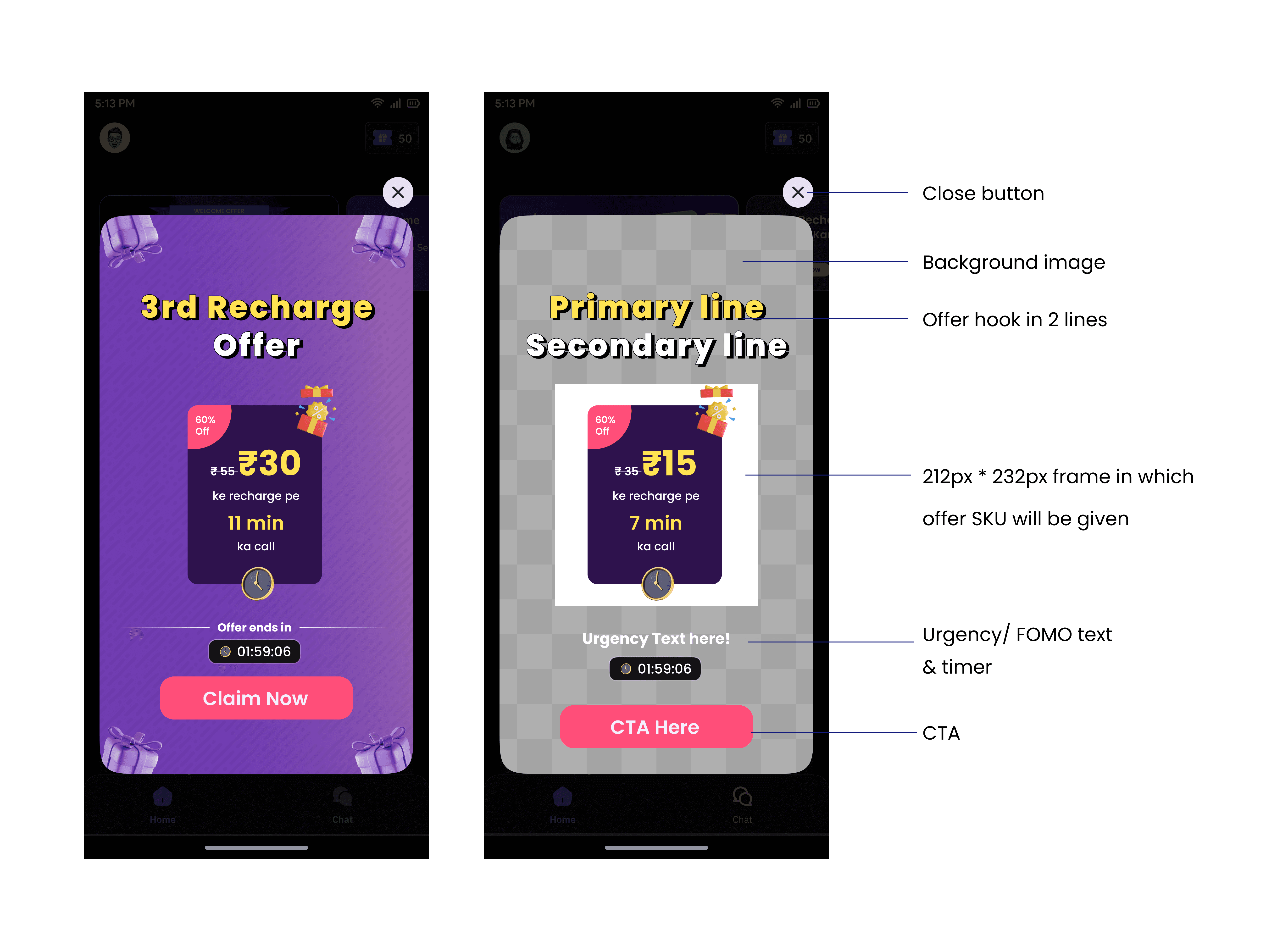
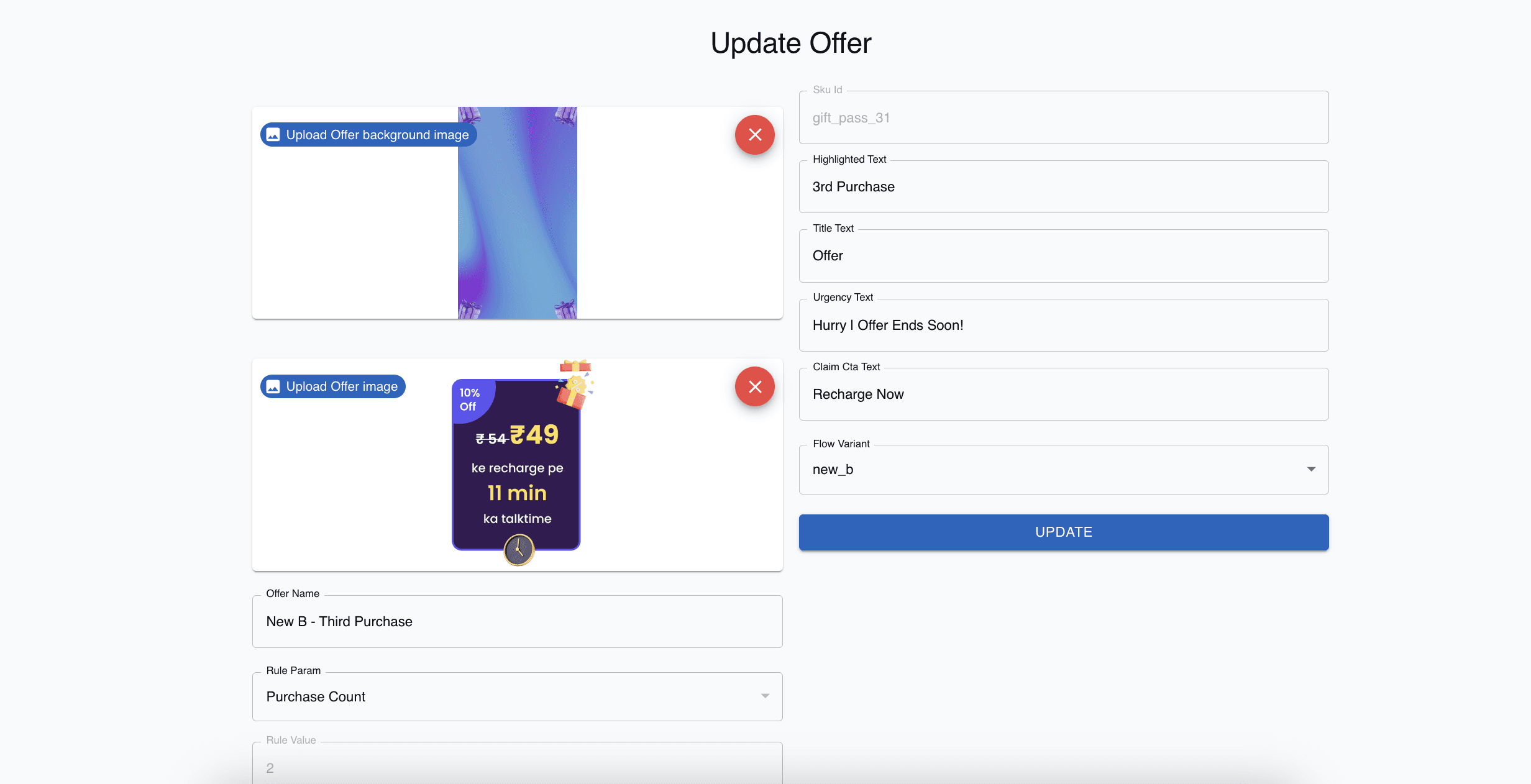
This is what the admin panel looked like, where anyone could just push a new offer, the only dependency on the backend was to just generate a new sku id, reducing the time to push offer, and increasing our pace to experiment.

Why we did it?

Speed was critical. Monetization needed an experimentation backbone so we could find what actually drove recharges rather than guessing.

Speed was critical. Monetization needed an experimentation backbone so we could find what actually drove recharges rather than guessing.

Impact

  • Offer creation time cut from ~1 day → under 15 minutes

  • 6× increase in experimentation velocity

  • First sustained revenue growth week-over-week after activation

  • Offer creation time cut from ~1 day → under 15 minutes

  • 6× increase in experimentation velocity

  • First sustained revenue growth week-over-week after activation

  • Offer creation time cut from ~1 day → under 15 minutes

  • 6× increase in experimentation velocity

  • First sustained revenue growth week-over-week after activation

  • Offer creation time cut from ~1 day → under 15 minutes

  • 6× increase in experimentation velocity

  • First sustained revenue growth week-over-week after activation

But after few weeks down the release, we hit a plateau in terms of ARPPU, and recharge funnel conversions. Hence we had to move to the next step.

⚙️ Step 2: Introducing Paid-First Call & Recharge Ladder

Problem

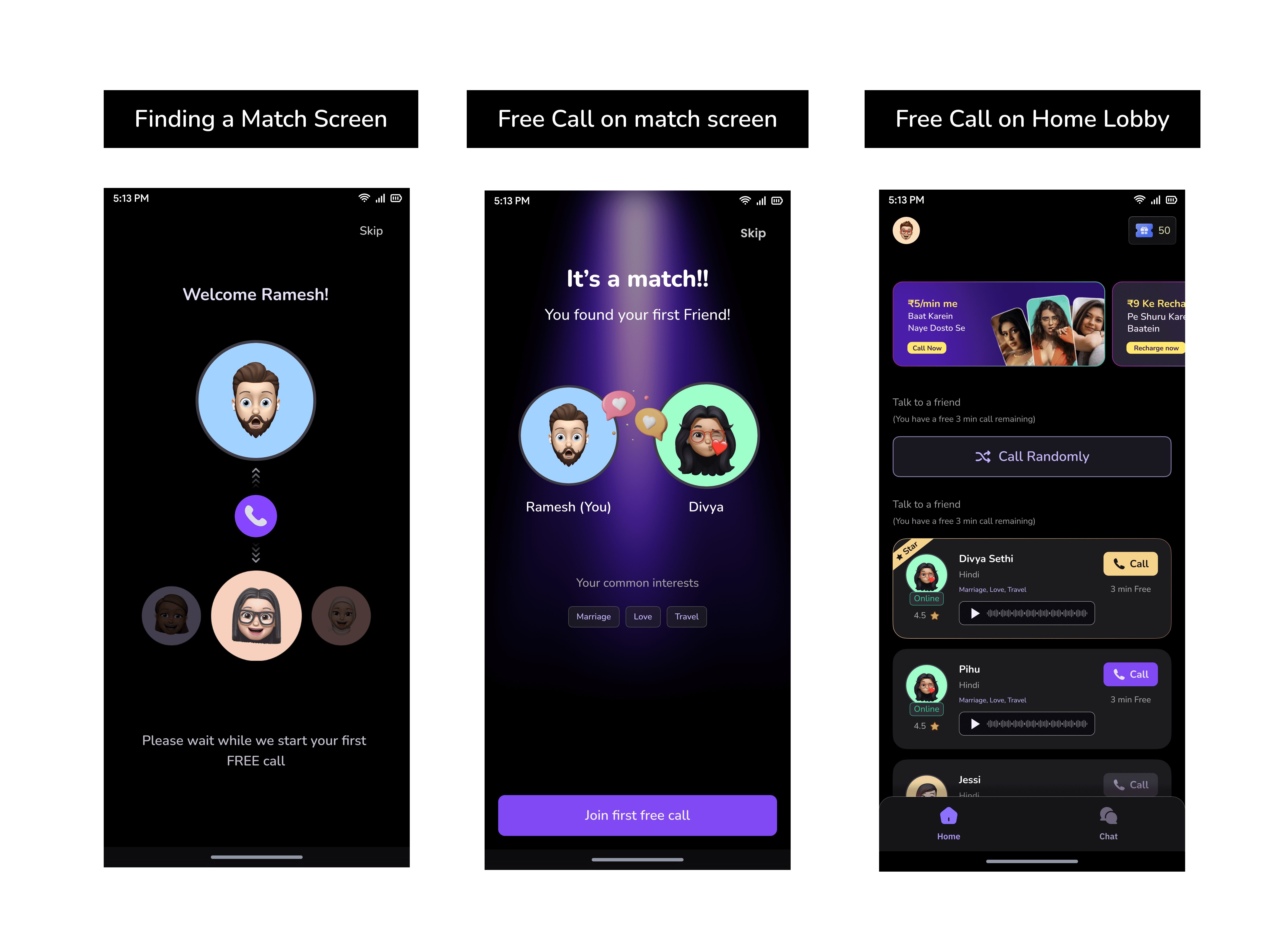
Despite faster testing, retention plateaued. Data and user interview insights showed that free first call led the users to expect no-cost interactions and they were constantly looking for more free calls after the first one, hurting 2nd-recharge conversion (< 20 %).

Free Call Screens

Free Call Screens

Free Call Screens

Free Call Screens

Solution

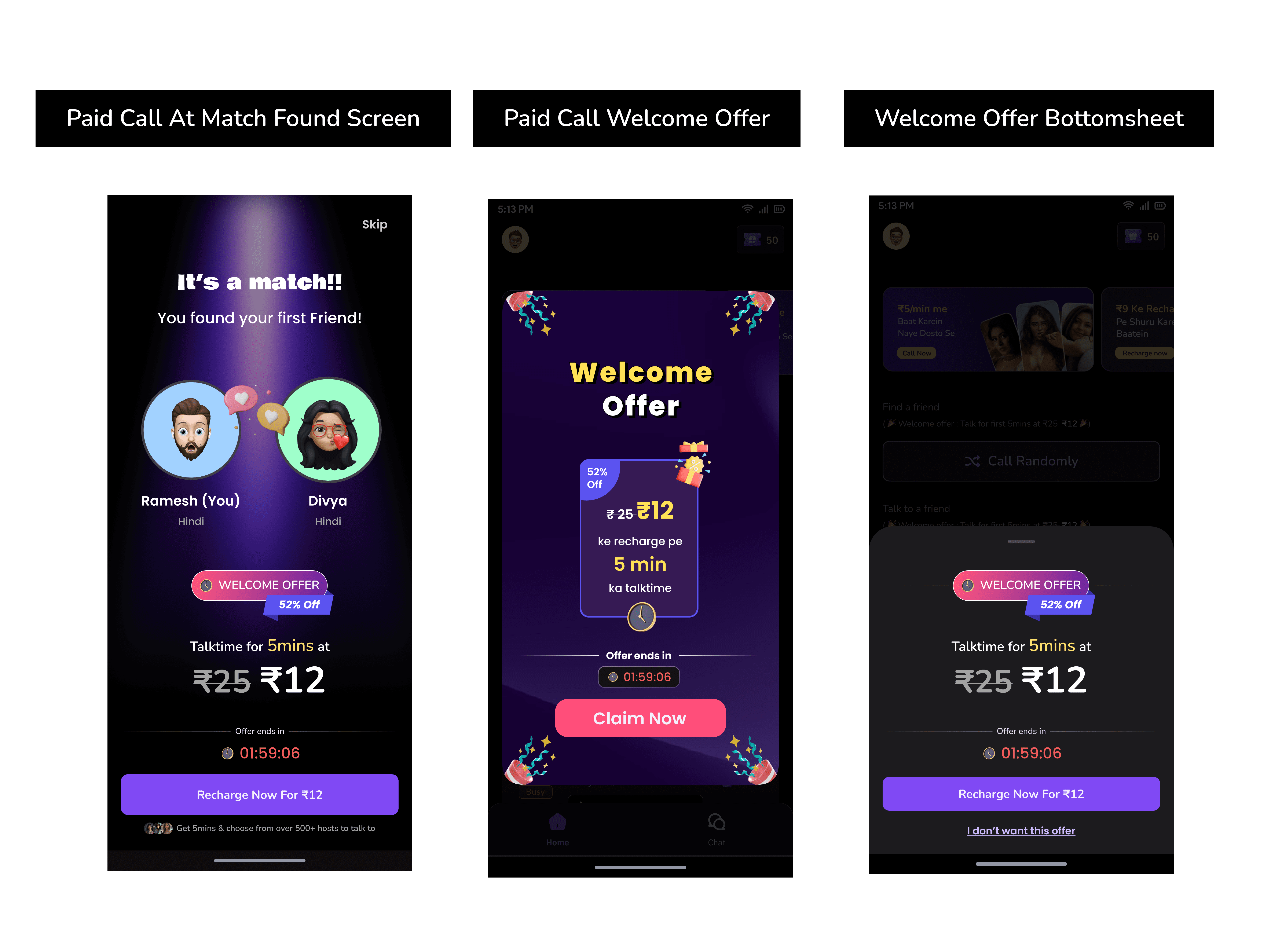
We replaced the free call with a ₹25 → ₹12 Welcome Offer shown during creator matching.
This triggered a low-friction first payment. Then, we designed a 1st→4th Recharge Ladder with progressive offers unlocking at each recharge to form habit loops. So that the user turns into a power user.

Paid Call Screens

Paid Call Screens

Why we did it?

We needed users to pay once, then feel progression and reward for continuing. It was also done ensure only high intent user proceeded further. And to mitigate the expectations of free calls on the platform.

We needed users to pay once, then feel progression and reward for continuing. It was also done ensure only high intent user proceeded further. And to mitigate the expectations of free calls on the platform.

Impact

  • Offer launch time reduced from 2–3 days

    to < 30 min

  • Continuous experimentation became possible

  • Offer launch time reduced from 2–3 days to < 30 min

  • Continuous experimentation became possible

  • Offer launch time reduced from 2–3 days

    to < 30 min

  • Continuous experimentation became possible

  • Offer launch time reduced from 2–3 days

    to < 30 min

  • Continuous experimentation became possible

With faster iteration, we could segment users by spending behavior.

With faster iteration, we could segment users by spending behavior.

With faster iteration, we could segment users by spending behavior.

Step 3 — Segmenting Users by Behavior

Problem

After early growth, ARPPU stalled. Generic offers didn’t scale across all users, and ₹20 spenders and ₹500 power users responded differently.

Solution

Using Mixpanel cohorts, we introduced segmented offers:

  • ₹1–150 → light users (friendly copy, low urgency)

  • ₹150–350 → growing users (balance discount vs cashback)

  • ₹350–500 → loyal users (time-bound premium offers)

  • ₹500+ → power users (high-value cashback rewards)

Each segment got unique visuals and expiry logic. And for that i templatized the offer, and sku design so that people from ops or product team would use the correct offer for the right cohort in the admin panel.

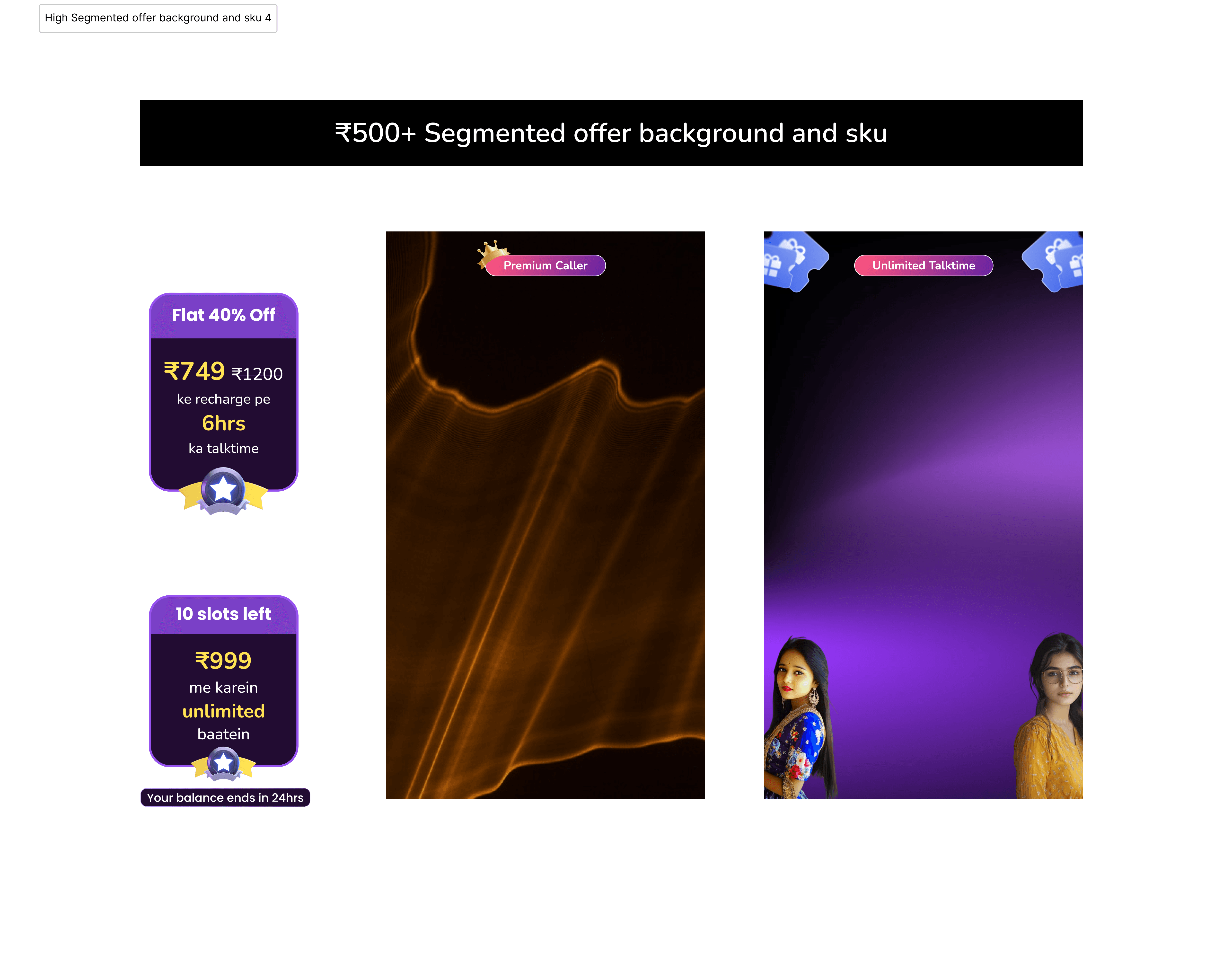
The recharge bottom sheet displays three SKUs in ascending order, with the middle one carrying an active offer to leverage the anchoring effect. Only one SKU is promoted at a time to maintain clarity and focus. The entry-level SKU dynamically adapts to a user’s last purchase or lifetime value, gradually nudging them toward higher purchase tiers without causing friction.


To streamline operations, I also templatized the background and SKU images for different cohorts, allowing anyone to upload offers directly through the admin panel. This reduced design dependencies and ensured consistent, on-brand visuals across all campaigns.

Why we did it?

To align incentives with spending capacity and push mid-tier users upward without alienating low-tier ones.

To align incentives with spending capacity and push mid-tier users upward without alienating low-tier ones.

Impact

  • Offer redemption rate ↑ 27 %

  • Avg recharge value ↑ 1.7×

  • Plateau broken → consistent ARPPU growth resumed

  • Offer redemption rate ↑ 27 %

  • Avg recharge value ↑ 1.7×

  • Plateau broken → consistent ARPPU growth resumed

  • Offer redemption rate ↑ 27 %

  • Avg recharge value ↑ 1.7×

  • Plateau broken → consistent ARPPU growth resumed

  • Offer redemption rate ↑ 27 %

  • Avg recharge value ↑ 1.7×

  • Plateau broken → consistent ARPPU growth resumed

Once segmentation worked, the next friction point was the recharge screen.

Once segmentation worked, the next friction point was the recharge screen.

Once segmentation worked, the next friction point was the recharge screen.

Step 4 — Redesigning the Recharge Lobby

Problem

Recharge SKUs looked identical, hiding value differences. Users defaulted to the cheapest pack. Pricing also lacked transparency in terms of best deal and the minutes equivalence visible.

Solution

We redesigned the entire purchase lobby:

  • Smaller gift-pass icons → focus on numbers of passes

  • Added slashed price + “Save X %” / “Extra Y Passes” badges

  • Introduced cashback tiers and timers

  • Defined SKU Domination Logic — progressive ladder where higher value packs get better per-minute pricing to nudge upgrades

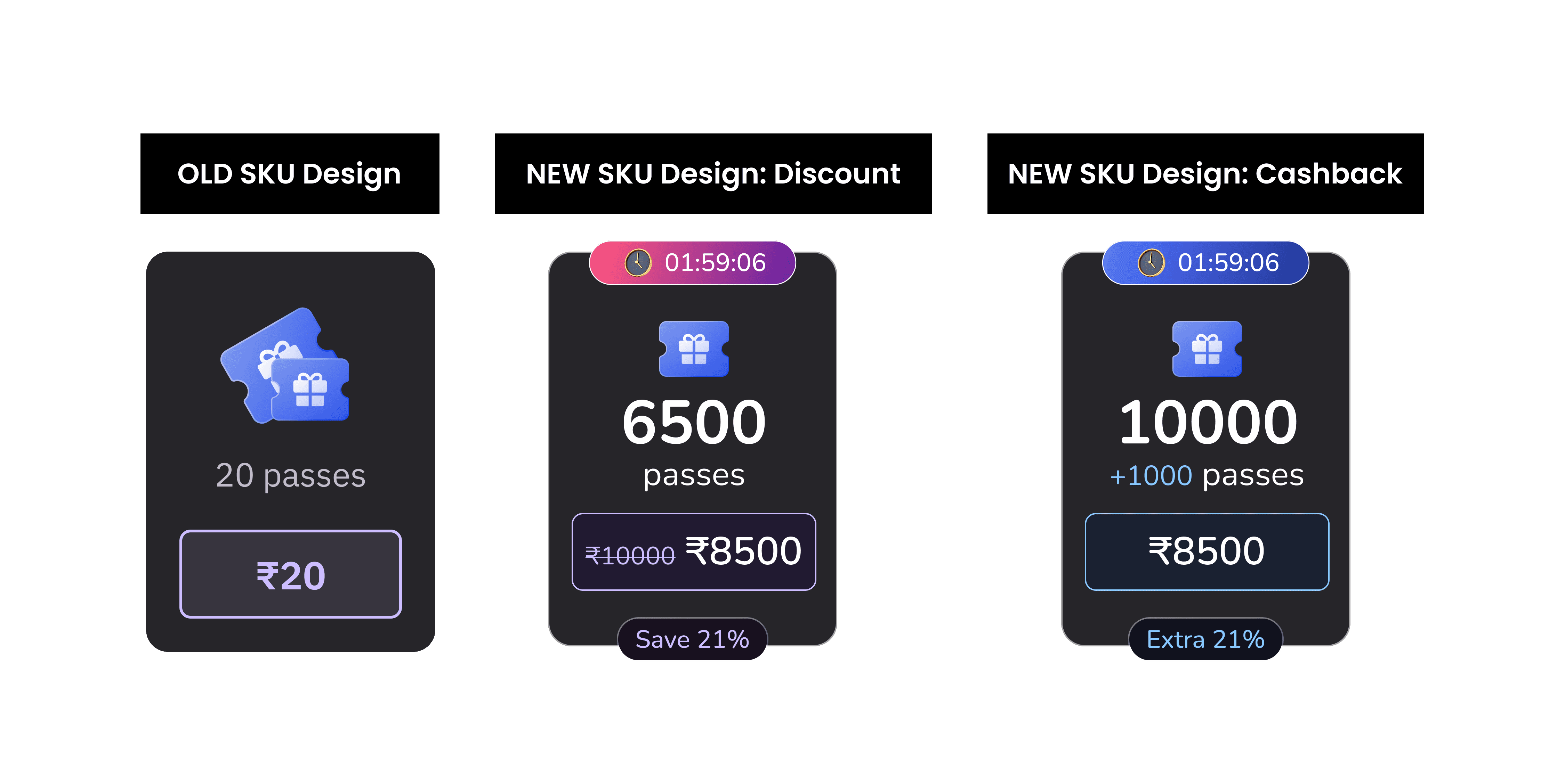
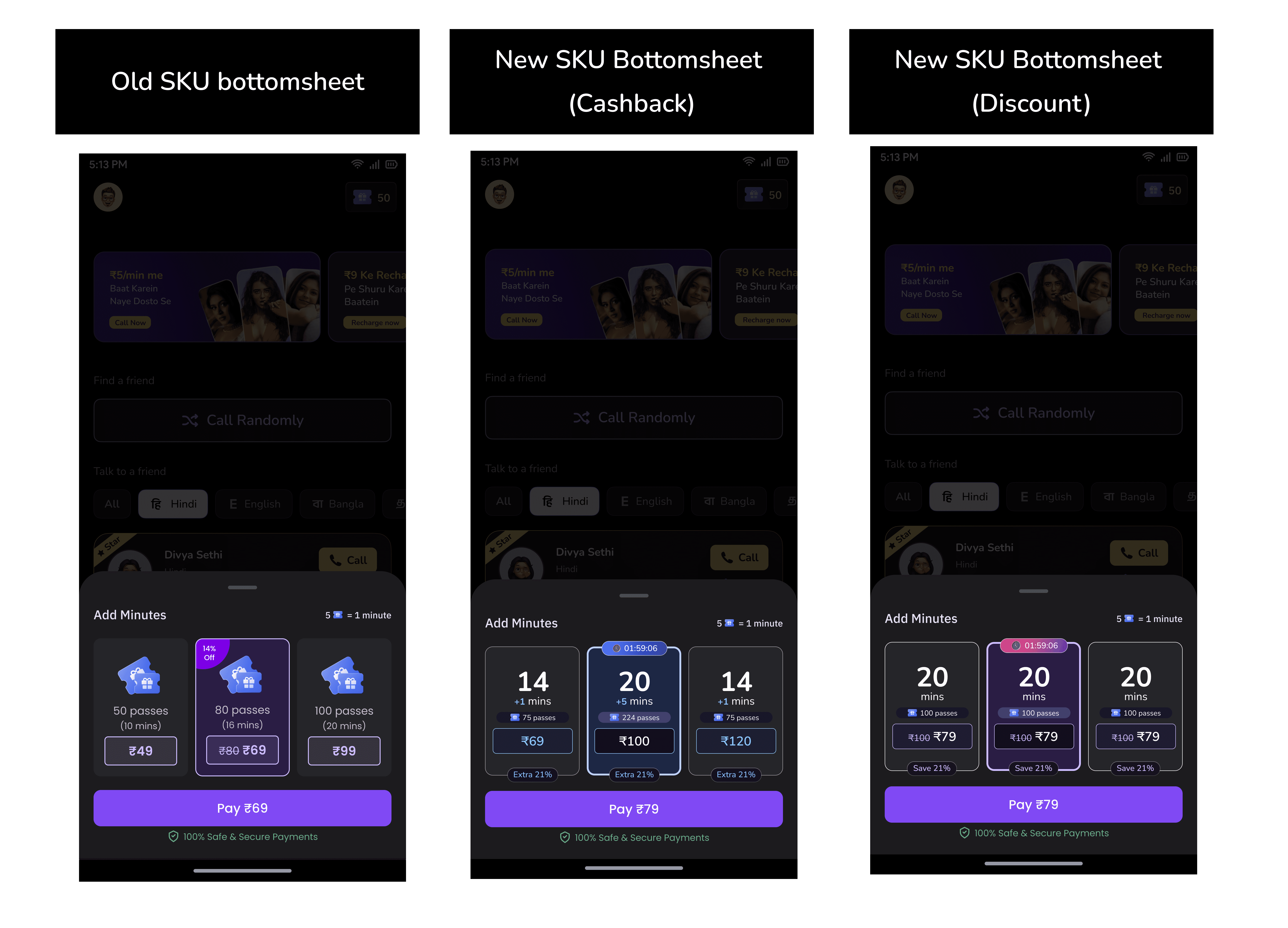
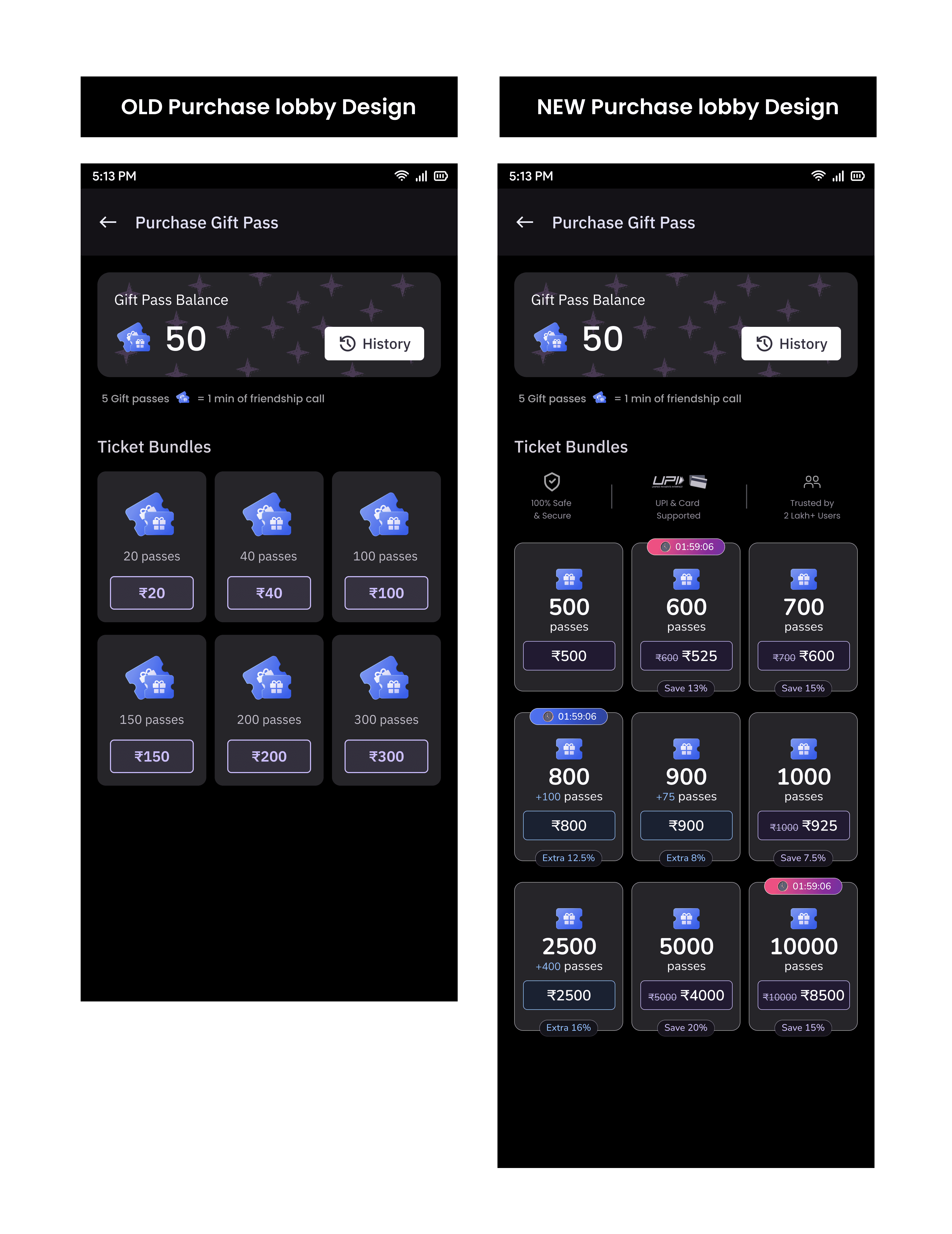
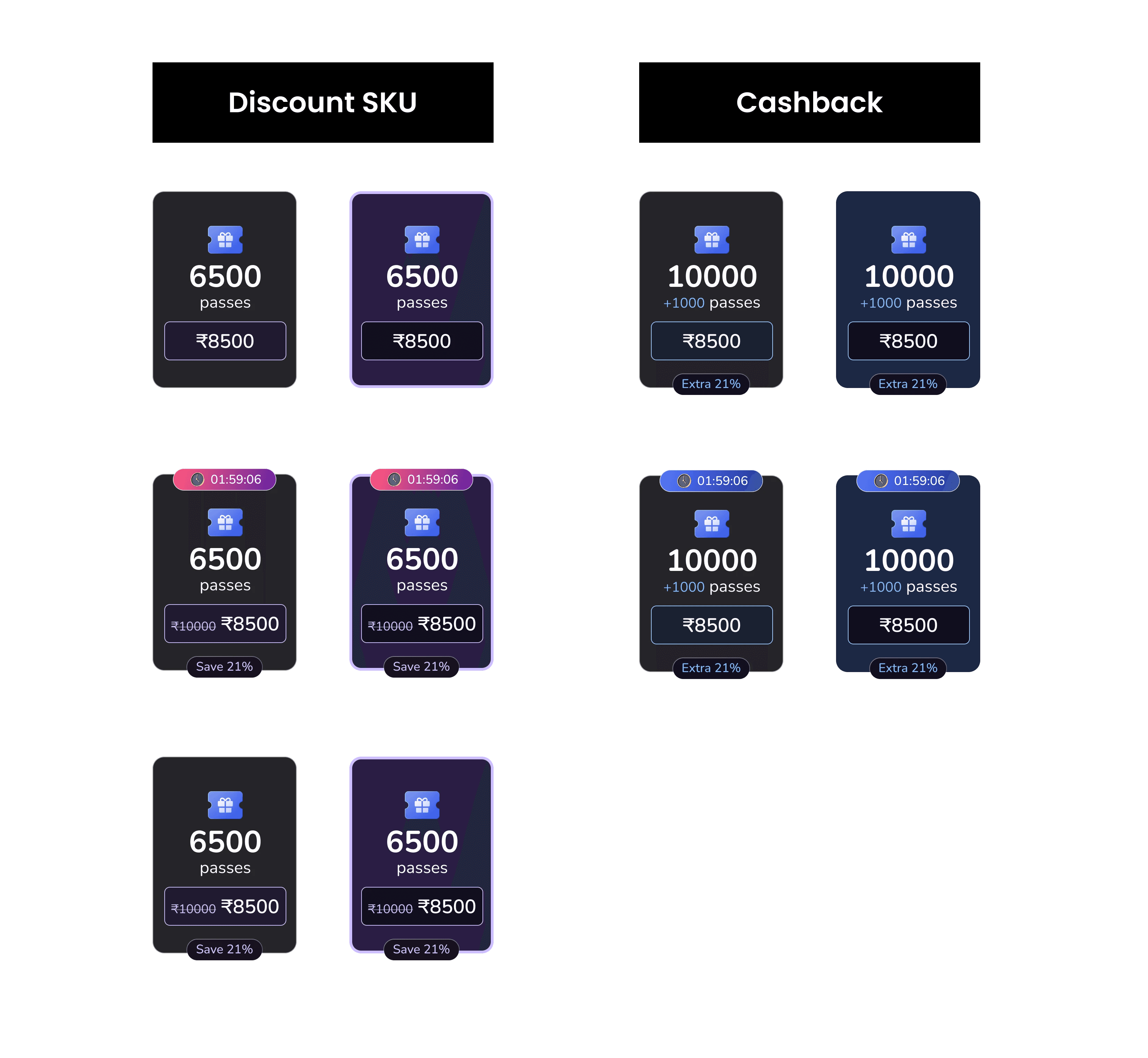
We identified confusion around perceived value across both recharge pathways — the three-SKU bottom sheet and the purchase lobby. To address this, we revamped the SKU layout and lobby design to make savings clearer and introduced cashback-based offers alongside discounts. This not only improved value perception but also nudged users toward higher payment tiers, boosting ARPPU. Finally, we refined the purchase flow to reassure users of the value they were gaining at each step — whether through a discount or cashback — while adding subtle FOMO nudges when they attempted to go back.

Why we did it?

Clarity and anchoring drive confidence — users should see what they’re getting and feel rewarded for spending more.

Clarity and anchoring drive confidence — users should see what they’re getting and feel rewarded for spending more.

Impact

Checkout completion ↑ 14 % (from clearer value hierarchy)

  • Avg recharge ₹36 → ₹61

  • ARPPU ₹44 → ₹92 (+109 %) — final profitability goal achieved

  • Revenue scaled to ₹35 L+/month sustainably

Checkout completion ↑ 14 % (from clearer value hierarchy)

  • Avg recharge ₹36 → ₹61

  • ARPPU ₹44 → ₹92 (+109 %) — final profitability goal achieved

  • Revenue scaled to ₹35 L+/month sustainably

Checkout completion ↑ 14 % (from clearer value hierarchy)

  • Avg recharge ₹36 → ₹61

  • ARPPU ₹44 → ₹92 (+109 %) — final profitability goal achieved

  • Revenue scaled to ₹35 L+/month sustainably

Checkout completion ↑ 14 % (from clearer value hierarchy)

  • Avg recharge ₹36 → ₹61

  • ARPPU ₹44 → ₹92 (+109 %) — final profitability goal achieved

  • Revenue scaled to ₹35 L+/month sustainably

Key learnings.


  • Speed drives clarity: The Offer Engine created momentum — faster tests revealed what actually worked.

  • Behavior before business: Once users paid once, retention and lifetime value followed.

  • Segmentation over scale: Personalized offers outperformed global discounts, sustaining long-term growth.

  • Transparency converts: Clear minutes, pricing, and GST built trust far more effectively than urgency tactics.

  • System thinking wins: True monetization design lies in connecting offers, flows, and logic — not just individual screens.


Let’s

connect

prag07298@gmail.com

Feel free to reach out for collaborations or to have a friendly chat.

© Made

with

♥️

Let’s

connect

Feel free to reach out for collaborations or to have a friendly chat .

prag07298@gmail.com

© Made

with

♥️

Create a free website with Framer, the website builder loved by startups, designers and agencies.