Personal Finance
An app that is a powerful tool designed to help users manage their financial responsibilities effectively. The app offers a range of features, including credit card tracking, transaction management, subscription and bill management, expense control, and budgeting tools.
Personal Finance
An app that is a powerful tool designed to help users manage their financial responsibilities effectively. The app offers a range of features, including credit card tracking, transaction management, subscription and bill management, expense control, and budgeting tools.
Personal Finance
An app that is a powerful tool designed to help users manage their financial responsibilities effectively. The app offers a range of features, including credit card tracking, transaction management, subscription and bill management, expense control, and budgeting tools.
Personal Finance
An app that is a powerful tool designed to help users manage their financial responsibilities effectively. The app offers a range of features, including credit card tracking, transaction management, subscription and bill management, expense control, and budgeting tools.
Client:
Klarna
Role:
Digital Designer
Year:
2020
Client:
Klarna
Role:
Digital Designer
Year:
2020
Client:
Klarna
Role:
Digital Designer
Year:
2020
Client:
Klarna
Role:
Digital Designer
Year:
2020

Introduction
The challenge for the personal finance mobile application was to provide users with a comprehensive solution for tracking their credit cards, managing their transactions, subscriptions, bills, and controlling their expenses. With numerous financial responsibilities, users needed a centralized platform that could help them easily manage their finances, avoid unnecessary expenses, and achieve their financial goals. The challenge was to create a user-friendly, intuitive, and feature-rich mobile application that could meet these diverse financial needs and provide users with a seamless experience.
Understanding the user
We need to understand where the user is coming from in order to nudge them into downloading the app from the Play Store.
What makes them click?
We need to understand where the user is coming from in order to nudge them into downloading the app from the Play Store.
What makes them click?
We need to understand where the user is coming from in order to nudge them into downloading the app from the Play Store.
What makes them click?

Essentially two factors:
Need
Curiosity
That’s how we can broadly classify our users into two categories
Essentially two factors:
Need
Curiosity
That’s how we can broadly classify our users into two categories
Essentially two factors:
Need
Curiosity
That’s how we can broadly classify our users into two categories

An organic user is clear about its needs, they will only download the app if their needs are guaranteed or reflected on the Play Store screens. This suggests that there’s not much you can do to nudge them into downloading your app.
Just ensure whatever key features your app has are clearly conveyed via Play Store screenshots.

An inorganic user is the one you have spent your money on to buy their attention, and they will only maintain their attention as long as you satisfy their curiosity. This is why a visually appealing screenshot design would incite the user to explore the app and download it out of curiosity.
Your Play Store screenshots should craft a beautiful visual story that nudges the user to download the app.

In order to fully utilize the potential of screenshots following points were explored:
Current guidelines for Google Play Store and Apple’s App Store
Best practices used by our competitors and other top-rated apps
Insights that can be derived from competitors and other top-rated apps
In order to fully utilize the potential of screenshots following points were explored:
Current guidelines for Google Play Store and Apple’s App Store
Best practices used by our competitors and other top-rated apps
Insights that can be derived from competitors and other top-rated apps
In order to fully utilize the potential of screenshots following points were explored:
Current guidelines for Google Play Store and Apple’s App Store
Best practices used by our competitors and other top-rated apps
Insights that can be derived from competitors and other top-rated apps
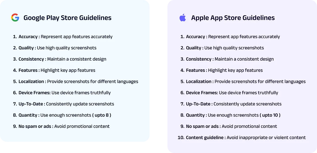
Generally speaking, it is easier to upload screenshots on Google Play with fewer rules than Apple App Store. With Google’s Play Store, you have the flexibility to be more creative with the screenshots, you can even neglect app UI on a few screens and use different imagery to convey the value prop ( Zomato and Blinkit have done that ).
Meanwhile, with Apple’s App Store, UI needs to be represented in the device frame, which also needs to be accurate, or else the screen will be rejected.
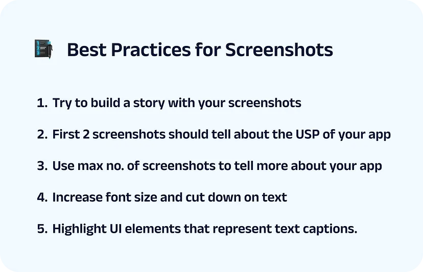
Competitor research
Over 40 competitor and top-rated apps were analyzed along with some secondary research on the best and most common practices for Play Store screenshots, and these were the insights we got:
Over 40 competitor and top-rated apps were analyzed along with some secondary research on the best and most common practices for Play Store screenshots, and these were the insights we got:
Over 40 competitor and top-rated apps were analyzed along with some secondary research on the best and most common practices for Play Store screenshots, and these were the insights we got:

Visitors spend an average of 7 seconds on the store listing page to decide whether they want to download the app.
Around 50% of users make their decisions based on first impressions.
60% of visitors don’t scroll beyond the fold of each product page.
Less than 10% of the users enlarge a screenshot.
Screenshots can be uploaded in 3 different dimensions

One could use multiple combinations of these dimensions, but it was observed that a majority of apps used portrait screenshots as they allowed them to show more value prop to users in the first fold.
Landscape was mostly used when a promotional video was to be shown.
Since fewer users enlarge a screenshot, the font size and length of text should be legible in the minimized state, for the user to make sense of your value prop.
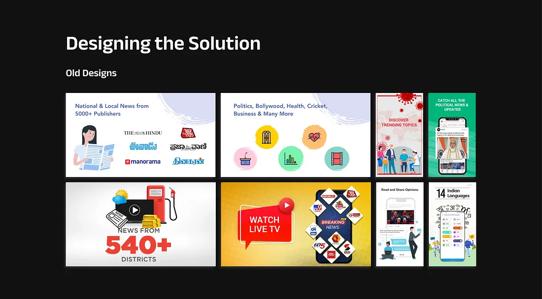
From all the insights and best practices we’ve gathered from the research it becomes evident that the old screenshot designs fall short in many areas, such as:
Poor visual appeal
The first 2 screens are landscape hence taking most of the real estate for the first fold( users will only see 1.5 screens unless they scroll which they rarely do )
Inconsistent design
Outdated representation of certain features and UI
Unclear story narrative
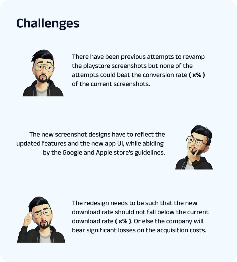
The real challenge was that in our previous attempts to redesign these screens, none of them could beat the download rate of x%.
And for some reason, this set of screens yielded the best download rate we’ve seen for our app.
It wasn’t really clear what worked and what didn’t, and a downside for experimentation was, if it didn’t work then the company would bear significant losses on acquisition costs. Hence we decided to follow the Iterative delta approach.
From all the insights and best practices we’ve gathered from the research it becomes evident that the old screenshot designs fall short in many areas, such as:
Poor visual appeal
The first 2 screens are landscape hence taking most of the real estate for the first fold( users will only see 1.5 screens unless they scroll which they rarely do )
Inconsistent design
Outdated representation of certain features and UI
Unclear story narrative
The real challenge was that in our previous attempts to redesign these screens, none of them could beat the download rate of x%.
And for some reason, this set of screens yielded the best download rate we’ve seen for our app.
It wasn’t really clear what worked and what didn’t, and a downside for experimentation was, if it didn’t work then the company would bear significant losses on acquisition costs. Hence we decided to follow the Iterative delta approach.
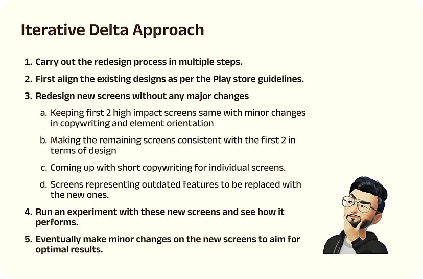
And this is what the iterated screens looked like
And this is what the iterated screens looked like
And this is what the iterated screens looked like
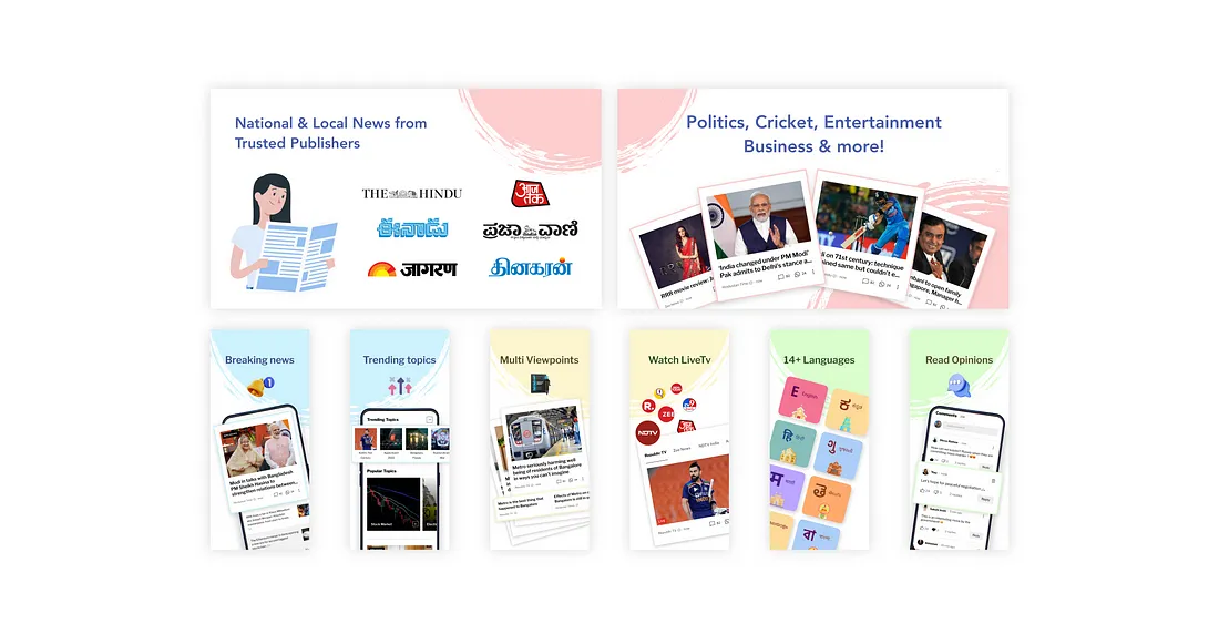
Experimentation
An experiment was run for these screens on the Google Play Store console for 2 weeks to see how they would perform compared to the existing screens ( x% conversion rate ). The result indicated that the new screens would perform somewhere between x% to x+2%!
This validated our new designs and encouraged us to further iterate upon it setting it as the new benchmark.
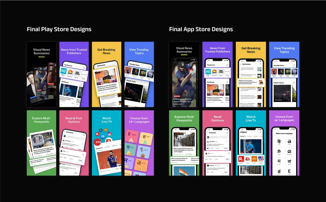
The next phase of iterations was to include the following changes
An experiment was run for these screens on the Google Play Store console for 2 weeks to see how they would perform compared to the existing screens ( x% conversion rate ). The result indicated that the new screens would perform somewhere between x% to x+2%!
This validated our new designs and encouraged us to further iterate upon it setting it as the new benchmark.
The next phase of iterations was to include the following changes
Make the Play Store screens a bit more vibrant, to incorporate the colors of the Dailyhunt logo.
Replacing the first screen with a new screen that promoted Xpresso ( a new feature that we were trying to push in the market )
The first two screens are to be made cohesive with the remaining screens in terms of design layout.
Rework on copywriting and font size
After considering these points the final version of the screenshots was crafted. Link here
After considering these points the final version of the screenshots was crafted. Link here
After considering these points the final version of the screenshots was crafted. Link here
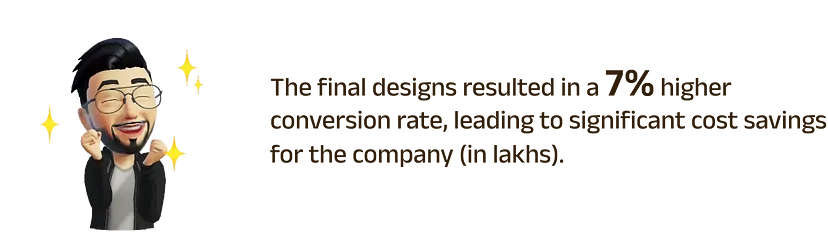
Results
Key learnings.
As I delved deeper, the project proved challenging despite its seeming simplicity.
In projects with potential financial risks, it's best to use a progressive iterative approach rather than making drastic changes from the start.
Ensuring accurate screen dimensions, while being cautious of Google and Apple's technical guidelines.
Be cautious of the news displayed on the app's screens, as it caters to a diverse audience. Controversial news or publicly disliked figures can deter users from downloading the app. So, ensure that the content is appropriate for all users.
Choosing the right value proposition to be displayed on the screens
Copywriting should be simple enough to cater to a diverse audience.
Ensuring that the users can easily understand the value prop without enlarging the screen